💼 boring expense reports → 20% more engaging experience
Never-ending monday 9 am problem
Sarah's coffee was getting cold. Again.
It was 9:17 AM on a Monday, and her Chrome browser was choking under fifteen open tabs – each has different client's expense reports. As a partner bookkeeper at Mitchell & Associates, this was her routine. But today was different. Today, I was with her in Zoom Meeting, watching this daily routine unfold.
"It's like being an air traffic controller," she jokes, "but with receipts instead of planes."
This wasn't just Sarah's story. This was the daily reality for thousands of accounting partners using Pleo's platform. And it was a problem worth solving.
What's Pleo, Actually?
Imagine a business credit card with a brain – that's Pleo, a smart B2B fintech platform that simplifies business spending with smart cards, automated expense tracking, thus ending monthly expense report chaos.
So, what I am supposed to do here?
My Role
Freelance UX Designer (Contract)
Team
2 Product designers, 2 Product managers, a CX manager & 5+ engineers
Timelines
12 weeks
When I joined Pleo as a freelance designer, the initial brief seemed straightforward — Refresh the partner portal's brand. But as I sat with Sarah that Monday morning, I realized we were solving the wrong problem.
The platform was solid. The problem was that we'd built it for individual companies/startups, not the accountants managing twenty of them.
Emil, Pleo Product Manager
My role? Figure out why accountants weren't using our Partner Portal, and fix it. Simple, right?
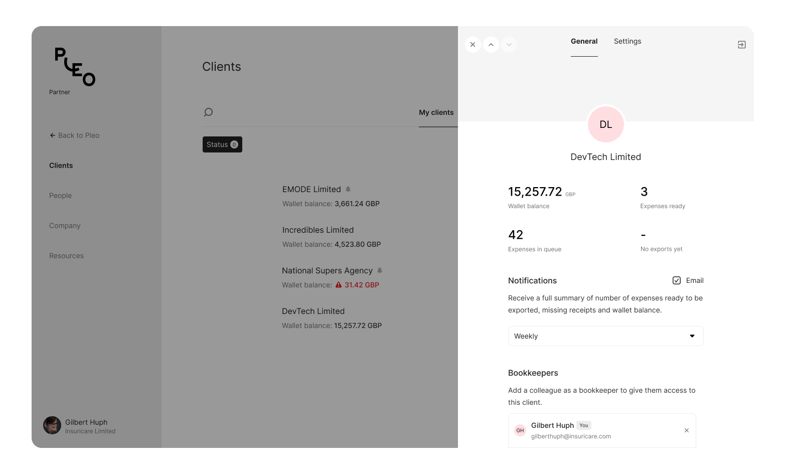
Just a preview :)
Getting down to the business
Getting to know our partners meant getting uncomfortable. We scheduled virtual 1-1 meetings, shadowed bookkeepers, and asked a lot of questions that made us squirm:
- "Why do you avoid using our portal?"
- "What makes you choose to open another tab instead?"
- "When was the last time you actually spent more than two minutes here?"
I realized we were dealing with something far more fundamental—a crisis of cognitive load.
The traditional playbook of sitting with users wasn't an option in 2020. So we got creative:
-
Virtual Shadowing: Using screen sharing, we watched 12 accountants go through their morning routines. The tab chaos was just the beginning.
-
Digital Journey Mapping: Through Miro sessions with users, we mapped out their actual workflows versus what we thought they were doing.
Picture a typical bookkeeper's desk
Hidden beneath the surface → Journey Mapping + User Shadows
We didn't just interview partners - we lived their daily struggles. At first glance, you might see someone efficiently switching between tabs. But there were subtle signs of friction — the slight pause before each context switch, the quick double-check of client names, the occasional sigh when navigating back to find that one crucial piece of information.
Unburying the real insights
One particularly enlightening moment came during a user shadowing session, we noticed partners opening the same client's account multiple times in different tabs. Why? Because they were trying to compare data across different time periods or categories.
"Watch this," said Sarah. She proceeded to demonstrate her morning routine of opening tabs, arranging them in a specific order, compares last month's expenses with this month's while keeping an eye on their wallet balance. "I've gotten pretty good at this window management," she laughed, "but I shouldn't have to be."
Numbers from data analysis with Amplitude & MixPanel Page analytics told an even more compelling story:
70%of partners used the portal solely as a gateway to client accounts.- Partners spent up to
5 hours weeklyjust managing tabs (that's 260 hours yearly!) - Average time spent was less than
2 minutesper session. - Only
30%actively referred new clients—a figure lower than many politicians' approval ratings.
Making sense of the chaos
The Aha Moment:
We realized partners weren't just switching between clients—they were trying to create their own
makeshift dashboards. The solution wasn't just about reducing tabs — it was about rethinking how
data could be presented and compared.
After three weeks of virtual sessions, patterns emerged:
- Context Switching Was Killing Productivity - Accountants had to constantly compare multiple clients instead of focusing on one.
- Critical Information Was Buried - Crucial info like missing receipts and low balances was buried behind clicks.
- Our Mental Model Was Wrong - We designed for sequential workflows, but accountants worked in parallel, monitoring all clients at once.
tl;dr Partners themselves creating their own ad-hoc dashboards to group similar clients
What's the MVP?
The transformation began with a simple question — What if the Partner Portal could be more than just a gateway? What if it could be a command center?
We designed the new portal around three core principles:
- Visibility Without Overwhelm
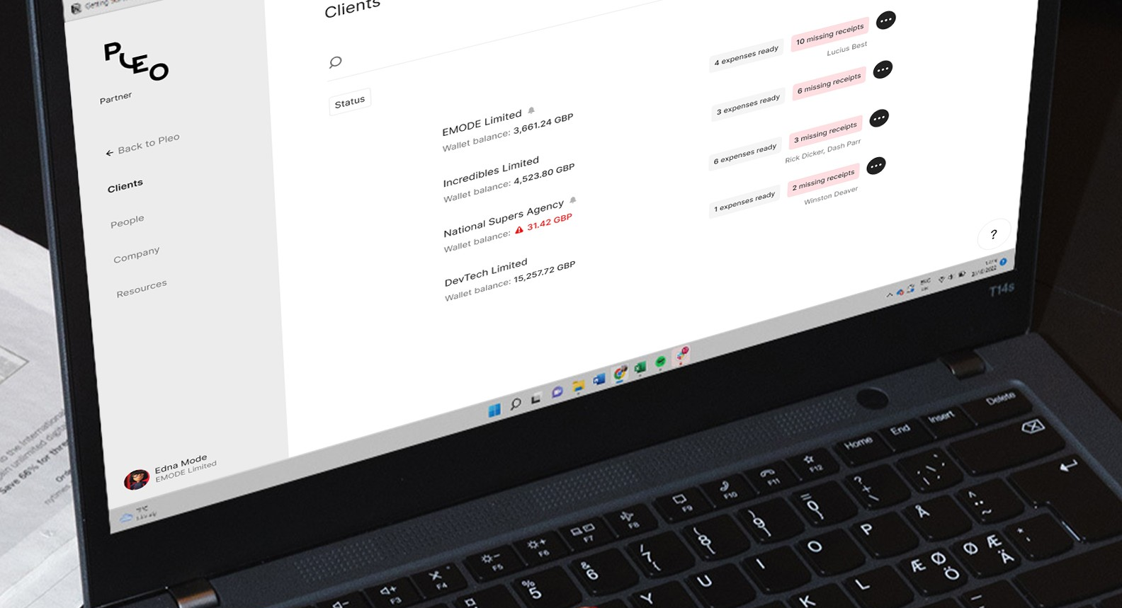
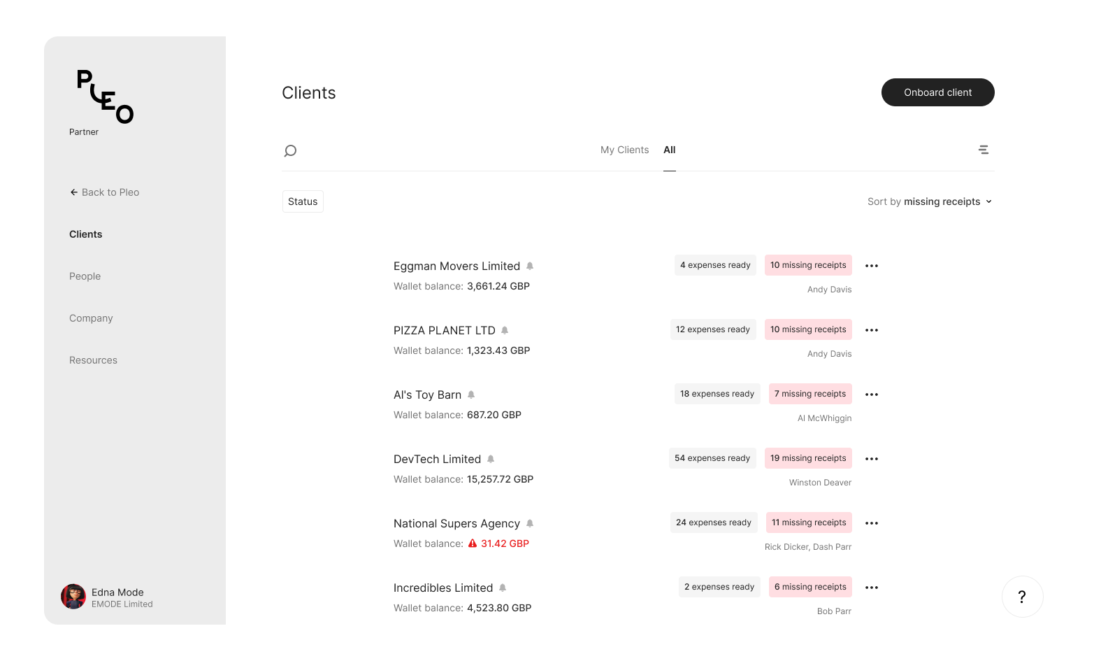
- Created a unified dashboard showing key metrics and recent activities across all clients, instead of multiple client tabs.
- Added partners requested features –
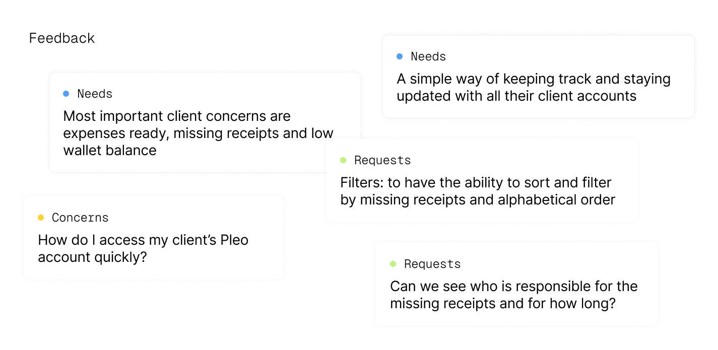
low wallet balances,missing receipts,expenses ready, and pending actions.
Remote Design Insight:
Screen sharing during design sessions led to immediate feedback. Partners could point to specific
elements and say, "That's exactly where I need to see the missing receipts count."
- Proactive Problem Solving
- Implemented smart filters that actually matched partners' mental models that allowed partners to — Group clients by status, Sort by urgent actions needed, Create saved views for different workflows.
- Added wallet balance alerts to prevent payment disruptions

- Contextual Intelligence
- Designed a drawer system that maintained context from main page while diving into specific client details.
- Built smart notifications with
opt-in email notificationsthat understood partner priorities.
Finding #248:
Partners in early beta phase who could see aggregate data across clients were 3x more likely to proactively prevent expense issues rather than react to them.
Measuring Success
After releasing the new client page, we tracked performance between the old and new versions. By the second month, the new page outperformed the old by over 100%. By the third month, while the gap narrowed, the new page still had more views and engagement.
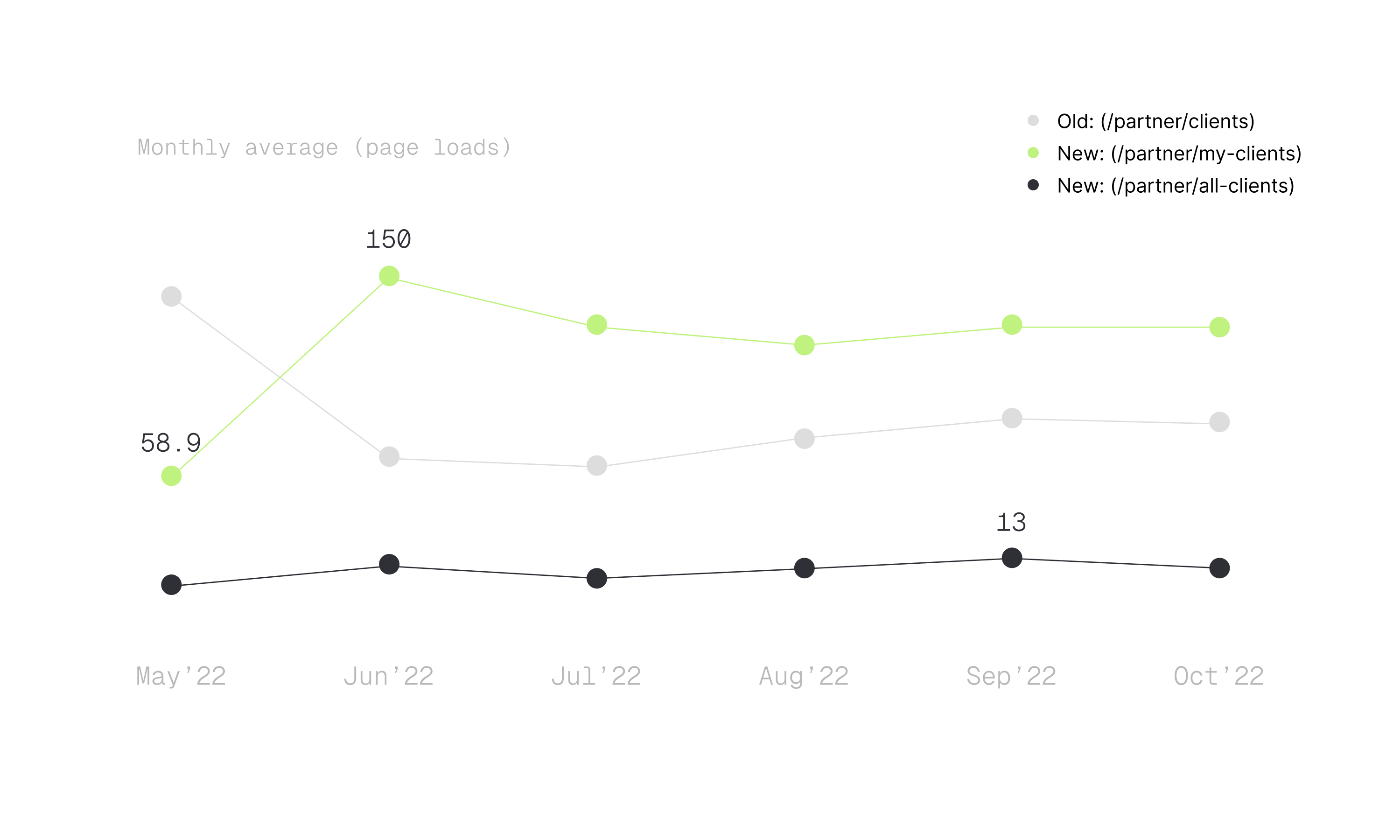
20% increasein feature usage, frequency, and time spent in the portal.16% risein new partners within the first three months.17% boostin partner client referrals during the same period.
But perhaps the most telling metric wasn't in our analytics—it was in the words of our partners,
You see, now I finish my Monday morning client's expense reviews before my coffee got cold.
Sarah, Same partner bookkeeper who complained initally, 1 month after launch
Nothing is quite "final", is it?
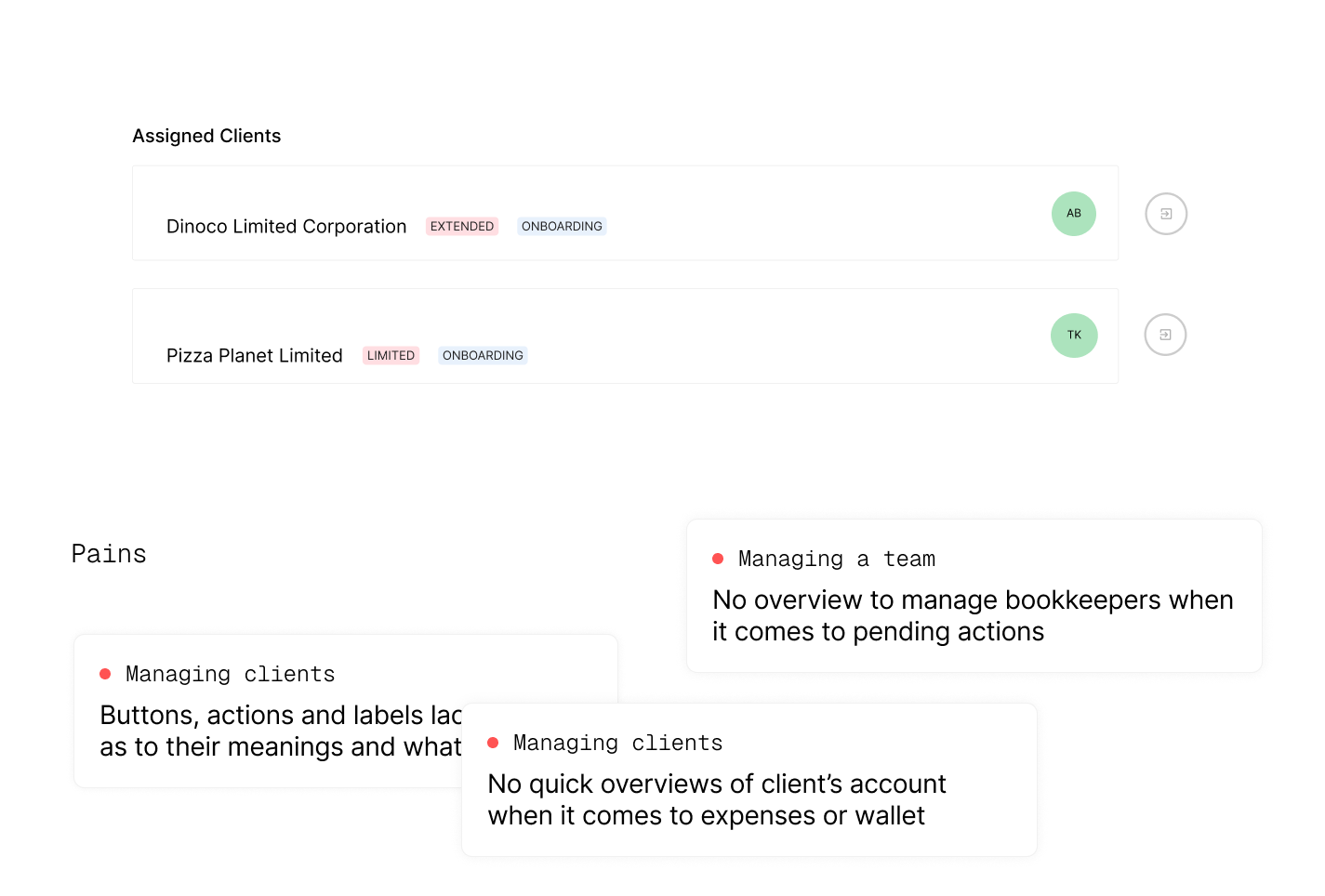
Of course, not everything worked perfectly at first. We noticed partners struggling with the client assignment process – they didn't realize they needed to be assigned to a client before managing their account. Our first solution? Tooltips. They were beautiful, clear, and... completely useless because nobody hovers long enough to read tooltips. Classic designer mistake !
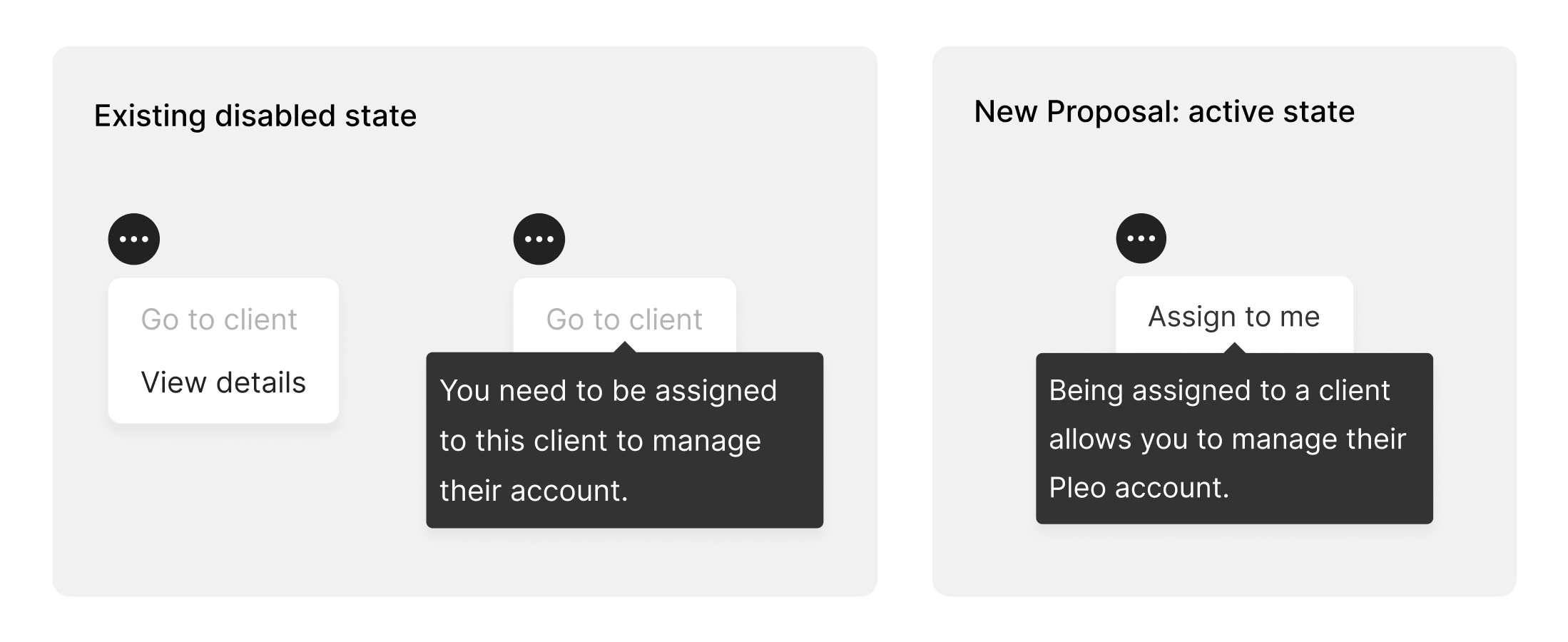
So we flipped the script. Instead of "Access Denied," we added "Click to Get Assigned." Simple. Direct. It worked.
Credit card number (required)
Invalid field.
before
Simply state what's wrong and leave users guessing as to how to resolve it.
Credit card number (required)
Enter your valid credit card number.
after
Communicate error messages in a way that guides the user towards a solution.
Also, Conveying clear, helpful error messages guides users to a solution, not just stating the problem (UX 101).
Key Takeaways
- Simplicity Isn't Simple - Creating an intuitive experience requires deeply understanding complex workflows.
- Find the Hidden Systems - Users often build their own solutions around your product – pay attention to these.
Sometimes the biggest impact comes not from adding features, but from removing the need for workarounds that users have become too familiar with.
Want to know more about how I conducted multi-lingual remote usability interviews?
Get in touch to schedule a presentation.